

Intro
Have you ever wanted to change your career and figure out Front-end? If you are the one who didn’t have a chance to study in this field, or haven’t got any reliable friends who could provide you with simple answers to your beginner’s questions, then this guide is probably for you. Here, I will share my personal findings and try to explain them as simple as possible. Most of these topics will also come in handy if you are going to prepare for an interview.
Please keep in mind, that I’m not a professional IT tech guy who know everything! Here, I’m only documenting my progress in the Frontend field. This information has helped me a lot in creating my pet projects and commercial websites.
Code Editors
Every project starts with a code editor. They are designed to write, edit code and boost your productivity. These editors can support multiple programming languages and are usually equipped with a range of features such as syntax highlighting, code completion, and debugging tools.
One of the main benefits of using a code editor is the ability to work with multiple programming languages. If you are interested in data analysis, artificial intelligence or scientific computing, then Python is the right choice. If you need to create a good-looking and responsive page with dynamic elements inside a browser, then it is JavaScript. Maybe you want to create enterprise-level applications, or servers, take a look at Java. Or maybe you want to create high-performance apps for Windows or Linux? It’s probably a job for C++ and C#. The list of programming languages is huge and there are no limits.
Code editors open many possibilities for developers to create a wide range of different projects for small businesses or large companies. But choosing the right tool for a job can be overwhelming for the newcomers. Look no further! Below, I’ll mention three well-known code editors for new and skilled developers.
Vim

Vim is a highly configurable text editor that is widely used in the programming community. It was initially released back in 1991! It is known for its efficiency and speed, as well as its ability to be fully controlled using only a keyboard.
Vim also has many plugins (Vim Awesome) and extensions available, allowing users to customize and extend its functionality. This makes it a popular choice for experienced developers who want a high level of control over their text editor.
Overall, Vim is a powerful and efficient text editor that is popular among experienced developers. While it may have a steep learning curve, it can greatly improve productivity once mastered.
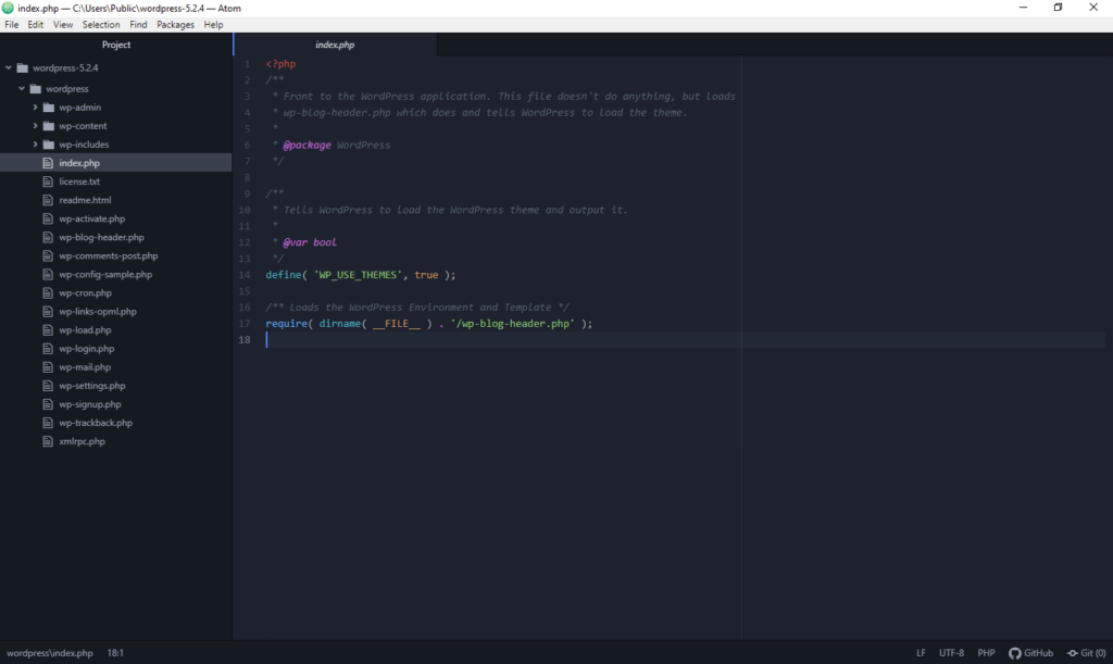
Atom

Atom is another popular open-source code editor developed by GitHub in 2014. It is known for its modern and intuitive interface, as well as its wide range of features and customization options. However, it should be noted that GitHub retired Atom on December 15, 2022. It is archived and no longer receives updates or security fixes, so don’t choose it for new projects. Its spiritual successor is Zed, made by Atom’s original creators.
One of the main benefits of Atom is its cross-platform compatibility, allowing it to be used on Windows, macOS, and Linux operating systems. It also has numerous plugins and themes available, allowing users to customize and extend its functionality.
Some of the key features of Atom include a file system browser, multiple panes for editing and comparing code, and support for over 80 programming languages. It also has built-in integration with Git and GitHub, making it a great choice for developers who work with version control systems.
VSCode
Visual Studio Code or shortly VSCode (not to be confused with Visual Studio) is a free and open-source code editor developed by Microsoft. It is known for its fast performance, intelligent code completion, and wide range of features and extensions. It is by far the most popular code editor nowadays and for a reason.
One of the main benefits of VSCode is its highly customizable interface, allowing users to tailor the layout and appearance to their personal preferences. It also has numerous extensions available, which can be used to add new features or support for additional programming languages.
VSCode is also designed to be used with version control systems such as Git, allowing developers to easily track and manage changes to their code. It also includes built-in debugging tools and support for many popular programming languages, making it a powerful and versatile tool for developers.
In any case, if you are still looking for the best code editor with many extensions, then pick VSCode, you won’t regret it.
Best Extensions (for VSCode)
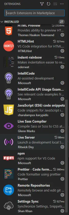
Assume you have picked a code editor, and it is VSCode, which extensions are a must for this tool? Well, you can of course open the extensions tab in the app and see all the recommendations for yourself, but here’s my personal list of extensions that I use daily as a junior frontend developer:
Auto Close Tag + Auto Rename Tag – the name says it all. VSCode by default doesn’t allow renaming both, open and closing tags. This extension changes this, making the coding process more efficient.
Color Highlight – highlights which hex colors are used from CSS in a human form.
ChatGPT – helps you generate and debug code. It connects to OpenAI models using your own API key.
Azure Repos – allows interacting with the repository remotely without even downloading it to your device.
Vscode-icons – a simple extension to add colorful icons for each different language and framework.
GitHub Pull Request + GitHub Repositories – lets you interact with any GitHub repository without leaving your code editor.
GitLens + Git History – simplifies version control for your projects. It shows who, when and what was edited over time. It will be especially useful if you plan to work in a team.
HTML CSS Support – validates tags and attributes, plus it adds auto-completion and suggestions to your code.
HTMLHint – analyzes and reports warnings or errors in an HTML document in the status bar. Useful for new web programmers, who are not familiar with HTML.
Indent-rainbow – visualizes your code, making it more colorful and readable.
IntelliCode – AI assistant which suggests you a code based on its context. Useful for JavaScript / TypeScript developers.
JavaScript (ES6) Snippets – implements new code snippets to work with ES6 syntax such as: promises, arrow functions, declarations and modules.
Live Server – creates a virtual (localhost) server on a local machine to test your web applications or pages. It also supports auto-reload, whenever new changes in the code occur.
NPM – useful extension to work with Node.js scripts, packages and builds.
Prettier – reprints (aka. formats) your code with its own rules, wrapping and making it more readable for you or other developers.
Tabnine AI – another AI assistant which supports more programming languages than IntelliCode. It has integrations with other code editors, and it also has a premium paid plan.
Settings Sync – you no longer need an extension for this: VS Code has built-in Settings Sync (gear icon → Backup and Sync Settings), which syncs your settings, key bindings, snippets and extensions to any other PC through a GitHub or Microsoft account.
HTML Basics
HTML5 is the latest version of the Hypertext Markup Language used to create and design web pages. It is an improvement over its predecessor, HTML4, and provides web developers with a set of new and powerful features. HTML5 has improved accessibility features, including support for ARIA (Accessible Rich Internet Applications), which makes it easier for people with disabilities to navigate and interact with web pages.
Another significant feature of HTML5 is its support for responsive web design. With the increasing use of mobile devices for web browsing, it is essential for websites to be responsive to different screen sizes. HTML5 provides developers with tools to create responsive web pages that adjust to different screen sizes, ensuring that users have a consistent browsing experience regardless of the device they are using.
How the browser renders a page
There is no secret that you’re reading this page by using a browser. No matter what browser you use, they all follow the same procedure to load all the code and create the final, good-looking page. How?
First things first, all web assets are stored on a remote server, which usually has a static IP address (something like 16.121.90.244), but you won’t see that address for sure, as they are hidden behind domain names. Basically, your browser makes a DNS lookup to find the IP address behind the domain name and then establishes a connection with that server.
Once the connection between a browser and a server was established, the browser sends an HTTP (GET) request (to server-side) and the server will respond and return specific data to you (client-side). Once all the data is received, the browser turns that data into the DOM – Document Object model, which represents HTML markup (meta, scripts, head, body, footer and other tags).
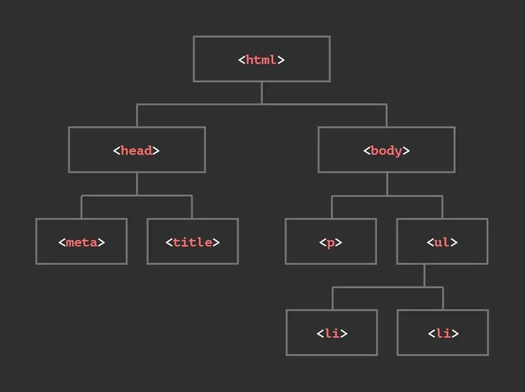
DOM represents all that chunk of received code as a tree of objects (nodes) that JavaScript can read and modify. While parsing the HTML, the browser also downloads the CSS stylesheets and builds the CSSOM – a similar tree for styles. The DOM and CSSOM are combined into a render tree, then the browser calculates the layout and finally paints the pixels on the screen. They can also be later enhanced by using JavaScript or other frameworks to make the page more interactable.
HTML Features
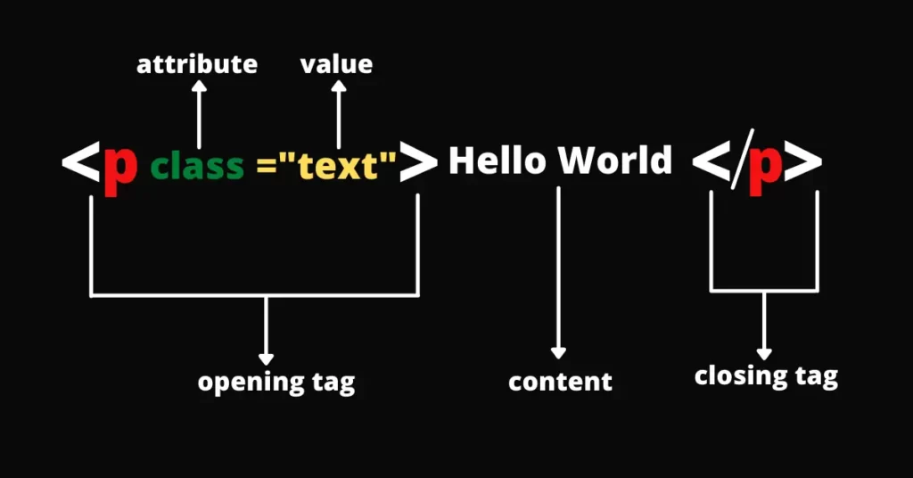
HTML, or Hypertext Markup Language, is the standard language used to create web pages. It is a markup language, which means that it uses a series of tags to describe the structure and layout of a document. These tags are enclosed in angle brackets, and they typically come in pairs, with an opening tag and a closing tag.
The Purpose of this HTML is to create the structure and layout of a webpage, while CSS (Cascading Style Sheets) is used to control the presentation of a webpage and JavaScript is used to control the behavior of a webpage. Together, these three technologies form the foundation of web development. I’ll take more about CSS and JavaScript later.
Semantic elements
Semantic elements have a pretty simple and straightforward purpose – to represent, organize and distinguish the code with the right tags and make it more readable. They usually help to define the piece of text, style, media or features. This includes: contact forms with <form> tag; adding scripts <script>; indicating quotation <blockquote>; highlighting text <mark>; images <img>; input data <input> and many more. The complete list of these elements can be found at the official MDN Web Docs.
Why semantics are important? Semantic elements are the key to optimizing your page for viewers, as well as for developers. It will make your code more readable, and it will positively affect your SEO score.
Opening links in a new tab
Sometimes it is necessary to let users open certain links in a new tab without doing extra work. You can apply this rule to any link you add inside your HTML <a> tag. Simply add this new attribute inside brackets: target="_blank"
e.g. <a href="https://google.com" target="_blank">Open Google</a>
Connecting external files
Connecting external files is an important step in every project. Even if it’s a small pet-project, you’ll definitely need to connect favicon (the icon that shows in your tab), add CSS Stylesheets or some JavaScript files to enhance your web UI.
This can be done by using <link> tag inside <head> tag of HTML file. Most commonly, it is used to link to an external stylesheet file, as shown in the example below.
<link href="/style.css" rel="stylesheet">
<link href="/style-mobile.css" rel="stylesheet" media="screen and (max-width: 600px)">
<link rel="icon" href="favicon.ico">“rel” stands for relationship, and it basically tells the browser how to treat this connection in the document. “href” is the actual link to an external file. “media” is the optional attribute that can be used to load custom conditions as shown in the example above (line 2) – it tells the browser to load this version of stylesheet, only if the screen size is lower or set to 600px (mobile-only).
Input element
There are many different types of <input> that can be used in HTML. With them, you can create interactive controls in the web-based form to accept a wide variety of data from a user. This data can be later sent to the back-end server to be interpreted and return specified results.
Most popular, but not limited <input> types include:
type="button" creates a push button that can be programmed to control custom functionality.
type="checkbox" creates a box (usually for multiple values) that can be selected for submission in a form.
type="email" adds a validation field to let users enter their email addresses. If the text is not formatted as email, it will return an error message.
type="file" allows users to upload one or more files from their devices to a server. This type requires client/server interpretation. It can be done with PHP, Nodejs (Express), Python (Django) or other server technologies. You will also need to take security measures to protect your server from possible attacks.
type="radio" similar to checkbox, but users can choose only one value at the same time for submission.
type="password" adds a field where users can enter their password with obscuring dots.
XML Sitemaps
XML sitemap is a file that contains every single link (from your posts, videos, images or files) in a structured form from your website. This file is usually located in the root directory of www, and it serves only one purpose – to provide information to crawlers and search engines.
Sitemap helps discover your website’s structure faster and makes it more appealing to search engines (SEO). It is recommended to create this file for large projects with many internal links.
Icon fonts or SVG?
Thinking to add your social network icons, but don’t know how? You can certainly do so, simply by adding font icons (like Font Awesome) or Raster images with <img> tag and scale them accordingly, but this actually requires plenty of work. You have to resize an image, make it in an appropriate format (ico, png, webp) to affect less performance and then make sure, that they look good on all devices. The downside is pretty obvious – these images have a fixed resolution, sometimes they are large in sizes, and it takes extra time for a browser to request each image from a server.
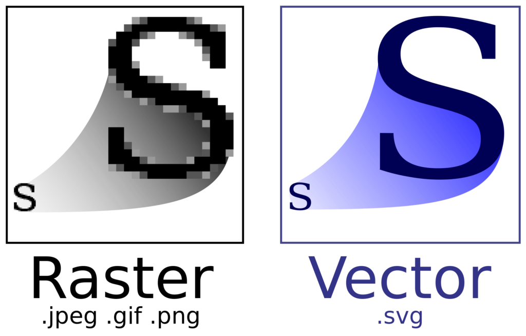
SVG or Scalable Vector Graphics is a block of code inside XML format, and it renders based on certain values, instead of the static image I mentioned above. This XML code is served directly to a browser. It offers relatively smaller sizes, higher performance, and it adds more scalability to your project. They can also be resized and still maintain sharpness and high quality for any screen sizes.
So long story short, font icons are much easier to deploy but harder to maintain, and your project may suffer due to poor optimization. SVG is clearly harder with all these values to draw the actual icon, but it is highly scalable and stable for larger projects that require high speed and stability.
CORS Standard
CORS or Cross-Origin Resource Sharing is an HTTP security standard that lets a server indicate which origins are permitted to request the information from a web server. In simpler terms, browsers follow the same-origin policy: JavaScript running on site-a.com can’t read responses from api.site-b.com by default. CORS is how that other server can relax the rule – it sends headers like Access-Control-Allow-Origin to say which origins are allowed to read its data. Note that regular <img>, <link rel="stylesheet"> and <script src> tags can embed files from other domains without CORS – it mostly matters for fetch() requests, web fonts and reading images inside a <canvas>.
Flash of unstyled content
Flash of unstyled content or FOUC is a problem that can occur when a web page is loading, where the page’s content appears briefly in plain HTML (without any CSS styles). This may happen when a browser builds a DOM from an HTML file and renders it before applying a stylesheet. FOUC is more noticeable when the responding server is not able to process user’s request fast enough to load the required resources. This may also happen when external scripts cause interruptions.
FOUC is generally considered a usability issue, as it can make the page appear broken or unfinished to the user. You can prevent this flash by including all critical styles in an HTML document or using server-side techniques with scripts to delay the initial rendering.
CSS Basics
CSS, or Cascading Style Sheets, is a stylesheet language used to apply “decorations” to an HTML document. This language allows you to control the layout, colors, and fonts of a webpage, as well as other visual elements such as backgrounds and borders. It also includes new and improved effects, such as animations, gradients, and shadows, which allow designers to create more engaging and dynamic web pages.
With CSS and media queries, you can also create complex styles for different devices (such as tablets, mobile or laptops) to create responsive elements. CSS is a 100% requirement nowadays for building professional and polished websites, so consider learning it deeper.
BEM – Component-based approach
BEM – Block, Element and Modifier is a component-based approach for web development. It can be useful to structure and store your code in separate parts for more flexibility.
A block is an independent and reusable component that can also consist of other blocks. It can be reused in other projects or pages. To make them look different, they can be changed with modifiers or class selectors to change their appearance, behavior, or structure.
Elements are stored inside a component. These are usually child elements, which should be styled and include a named class.
Modifiers – or properties are usually classes (selectors) that are added to a certain element to apply (aka. augment) features or change values for a reusable block to make it unique.
CSS Frameworks
There are many different CSS frameworks nowadays that can do pretty much everything to build your websites with ease. Some are less or more popular, but they all aim to “mobile-first” and attempt to bring as many components as the developers can to simplify the workflow. Below, I’ll only describe the features of three well-known frameworks: Bootstrap, Tailwind and Foundation. Some frameworks that are also worth mentioning: Semantic UI, Pure CSS, Bulma and Material UI.
Tailwind CSS

Tailwind is a CSS framework designed to build modern websites with HTML classes. It comes with responsive modifiers and reusable blocks to create pages faster. Most of the job is done with convenient and logical classes that represent simple and more complex CSS attributes. Whenever you add a Tailwind class to your element, it will automatically rebuild the (output) stylesheet for you, and you won’t need to touch that file again. Another feature here is that your CSS stylesheet will only have the required attributes to run your elements. No more leftovers in your code and it will keep compact.
More importantly, Tailwind CSS works with most build tools and frameworks, such as Vite, Next.js, Laravel, Astro or SvelteKit. It is easy to connect and start using it if you are already familiar with CSS.
There are of course downsides with this framework – Scaleability and code readability. While this framework certainly simplifies the process of building mobile-friendly websites without leaving an HTML file, over time you will generate a lot of different classes for all the elements that will pile up and reduce code readability. It also comes at the price of tweaking certain elements and debugging the stylesheet.
Bootstrap

Bootstrap is the most popular CSS framework nowadays. It was the first framework to start the “mobile-first” trend. It comes with many different grid-based components and Sass architecture. Even if you are not familiar with Bootstrap, you will be able to create quite a good-looking page with all the forms, hamburger menus, navigation bars, charts or progress bars.
For its advantages, Bootstrap has a large community backed by large companies that can provide answers to your questions and make your website look as planned. You will also find many different components to enhance your website and then customize them to your needs.
While Bootstrap has enough components and templates to build your first website, it comes at a price – speed and maintainability. If you plan to create just a small website for your personal needs or business, then prepare to deal with many unnecessary (unwanted) components which do nothing in your project. That’s because Bootstrap has most of its components built-in by default.
Foundation

Foundation is another CSS framework that provides a set of predefined styles and layout options for building websites. Just as Bootstrap, Foundation utilizes a 12-column grid system to arrange responsive elements.
While it offers pretty much the same functionality, the difference hides in complexity. Foundation has much more flexibility for creating unique designs and is intended for web designers, who want to tweak every single piece of an element. It is more like a do-it-yourself approach.
However, if you want to create a typical-styled website with basic components and without bothering much with the design, then Foundation is probably not for you.
CSS attributes
Inline and internal Styling
In most common practices, CSS attributes are stored in an external CSS file outside of HTML by using <link> tag. Inline on the other hand, stores all CSS styles inside an HTML file and inside an element – like <div style="color:red; font-size:46px;"></div>. Inline styling is not very popular, as it is used mostly only for older websites, and it can be hard to maintain and scale in complex projects.
Internal CSS, similar to inline, is applied inside the HTML file. But instead of putting these properties inside an element, we create <style></style> tag. Inside this tag, you can put native CSS properties. It is useful only if you are styling a single-page project and want to store everything in one place. Keep in mind, that these styles don’t apply to multiple HTML files. It may also become challenging in the future to maintain this file, and it may also affect performance.
Display:
There are 6 important “display” properties that you can choose for a certain element:
None – Using this value will completely hide an element and remove it from the layout, as if it doesn’t exist on the page. It is commonly used with JavaScript to create interactive elements for mobile devices: hamburger menu, scroll to top button, or other features.
There is an alternative way to hide an element in CSS from the page – by adding visibility: hidden property. It acts differently compared to display: none. Adding this property will not affect the element’s layout, meaning that it will still occupy its determined place, and it will only become invisible. All these properties also become non-interactable to end-user.
There is one more property which can hide your element from the page – opacity: 0. As the name suggests, it makes an element completely transparent (with value set to 0). Although it becomes invisible, just as with visibility:hidden, it can still be interacted or clicked.
Block – This property will create a “block” element that starts on a new line (always vertically) and it takes up all the available screen space. You can specify its space by changing height and width values. Compared to inline-block, it creates a line-break on the page.
Inline – Displays the element inside the line of text, next to other inline elements. Its size is defined by the content – setting width or height has no effect.
Inline-block – Similar to Inline, it creates a block where you can manually set the element’s height and width values.
Flex – This popular attribute will dynamically arrange items in rows and columns to create complex layouts. It introduces several new properties in CSS to work with display: flex. For example: flex-direction; flex-wrap; align-items; justify-content; align-self; gap; and others.
Grid – it is a two-dimensional (horizontal & vertical) system to place elements into specified column tracks or cells (like in table). This attribute uses different properties to create an entire and complex web layout or some specific elements like Gallery. Online Store or News. Compared to Flex, Grid is more customizable, and it has more control over different elements.
Position:
Static – is a default value for an element. Most properties like top, left, right, bottom, or z-index have no effect on this property.
Relative – an element will be positioned relative to its (self) position. You can also apply top, left, right, bottom, or z-index to adjust its position.
Absolute – Makes an element “absolute” removing it from the normal flow and forcing it to overlap other elements (on top of each other). Other elements will occupy the position of that element. It is positioned relative to its nearest positioned ancestor – an element whose position is not static (usually a parent with position: relative). If there is no such ancestor, it is positioned relative to the page itself.
Fixed – Forces an element to remain in the same place even if the page is scrolled. This will also remove an element from the normal flow, leaving its initial space. It has a similar effect to Sticky, but it keeps in the desired position indefinitely, and it is always relative to the browser’s viewport. Can be useful for creating pop-up windows, navigation bars or other blocks, which must always stay in sight.
Sticky – Same as Fixed, but a sticky element will stay in the normal flow, saving its initial space, and it will only “stick” once an offset was reached (scrolled). If you scroll back, this sticky element will “un-stick” back to its original position. Best used for scrollable elements – navigation bars, blog posts, or dropdown menus.
Z-index
Z-index is a property that creates an order for positioned elements. Elements with a higher z-index value can overlap other elements. Simply put, z-index acts like a layer in Photoshop or Premiere Pro. Each “layer” can stack on each other, and you can arrange them in a logical order. The layer with the highest value will appear in front of other elements.
This property works on positioned elements (absolute, fixed, sticky, relative) and also on children of flex or grid containers, even without a position value. Its value can also be set to negative.
Z-index will also come in handy if you want to create multi-layer UI with stackable effects or make a sticky navigation bar that must always stay above all other elements.
Border vs Outline
Border – is a line drawn around an element. It can impact surrounding elements and change the size or position of the initial element. Some useful attributes include – border-color; border-width; border-radius.
Outline – is a line drawn around an element (outside the borders). This line, unlike Border, doesn’t take up space nor change the size or position of the element. You can style this property by using outline-style or outline-color. This feature can be useful for changing the states of different elements like buttons, form fields or links.
Padding vs Margin
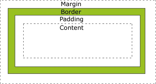
Padding – Controls a space inside an element. It is a space between an element’s borders and the element’s content. Padding is mostly used to change the size of an element, such as buttons, or widgets.
Margin – Controls a space outside an element. It can create gaps between other elements. This can be used to change an element’s position with margin-left; margin-bottom; margin-right; margin-top, center it with margin:auto, overlap neighbors, or add space.
Box-sizing:border-box
Box-sizing is a property that calculates width and height of an element depending on which properties apply (borders or padding). If you create a 100×100 px box and add a padding:20px, it will increase to 140×140 px (this is the default behavior of CSS with the property box-sizing:content-box). Box-sizing can change its calculations if needed. By adding box-sizing:border-box property, the 100px box will remain at 100px and the padding effect will instead apply to the inside.
Overflow:
Overflow is a property that can change an element’s behavior when the content cannot fit inside the element. Usually, when it happens, an overflowed element can unpredictably break surrounding styles and make the text appear outside the box. To prevent this from happening, we can use different values: overflow: auto; overflow: scroll; overflow: hidden. You can also specify overflow direction with overflow-x or overflow-y.
Vh & Vw values
Viewport Height (vh) is the unit that is relative to 1% of the height of the viewport (browser window).
Viewport Width (vw) is the unit that is relative to 1% of the width of the viewport (browser window).
This means, that if you set, let’s say height:100vh; the element with this property will fit an entire visible browser window (100%). These units are especially useful when creating responsive and adaptive elements. More on that below.
Justify-content & Align-items
These two attributes are used when you apply display: flex to an element, and they are used for positioning. There are two axes to consider – Main axis (horizontal) and Cross axis (vertical) – that’s the default for flex-direction: row; with flex-direction: column the axes swap.
You can align flex items along the main axis by using justify-content attribute.
As for the cross-axis alignment, you can use three different attributes: align-self, align-items or align-content. Each of them allows positioning your element vertically in a different way. What’s the difference between them? Align-self is usually applied only to a single item – other elements will be unchanged; Align-items works the same way as align-self, but it controls alignment to all children (all items) within the container; Align-content will move all elements along the cross axis and determine the spacing between each element.
Pseudo-classes
Pseudo-classes are intended to specify a state for the selected element. They are used to enhance your page and make it more appealing to users. The most popular pseudo-classes are: :hover (for cursor effects), :focus (to visually highlight a selected element or field), :visited (for links), :checked (for forms), :required (for highlighting required fields) and more. You can find all CSS pseudo-classes on MDN Web Docs.
Pseudo-elements
Pseudo-elements have a different purpose in comparison with pseudo-classes. These elements allow styling a specific part of an element. While pseudo-classes are indicated with a single : colon, pseudo-elements must be used with :: double colons. The most popular pseudo-elements are: ::after (adding styling after the element’s content), ::before (adding styling before the element’s content), ::first-letter (to apply style only to the first letter) and others.
Attribute Selectors
With this feature, you can apply different styling to an element that has a specific attribute inside HTML <tag>. It can be anything – a class, value, data, specific word or specified attribute.
In the example below, you can see, that we have two <input> tags with different types. Let’s say that you want to change text color only for one input (with the password), so for that, we add a selector and include the attribute inside [ ] – In the final results, only one input with the password will change its color.
<input type="password">
<input type="email">
<style>
input[type=password] {color: red}
</style>
Understanding CSS Specificity (priority)
Different CSS selectors like id, class, or inline basically have their own “weight” which can affect your page style. This may happen when you apply rules to a single element, but with different selectors. Selectors that have the highest weight / priority will apply that rule, while other rules will be ignored completely.
Why is this important? Because you can accidentally pile your project with unnecessary selectors and attributes that do not modify the page in any way, but take up space and decrease page loading speed. Stability and speed always come first!
Here are some “weight” values for a better understanding of this Specificity (more weight means higher priority):
| Type | Weight |
| Tag selector (<tag>) | 1 |
| Class selector (.class) | 10 |
| ID selector (#id) | 100 |
| Inline style (<tag style=””> | 1000 |
But what about !important argument? Can it override priority in the stylesheet? Yes, it can override all the specificity rules, even the inline. However, it is not recommended to use it, because this argument can create even more chaos in your style, and it basically breaks the natural behavior of a stylesheet.
Adaptive vs Responsive Design
Responsive design uses one fluid layout that adapts to any screen width and reflows smoothly as the window changes. It is built with display:flex properties, display:grid, viewport (vh, vw) units, relative sizes (%, rem) and media queries where needed. No matter how wide or narrow the user’s browser is, the page can adapt to that resolution and still provide an identical experience and usability.
Adaptive design on the other hand prepares several fixed layouts for specific screen sizes and switches between them when a breakpoint is reached, for example with @media screen and (min-width: 900px). Between breakpoints the layout doesn’t stretch. This approach is usually chosen when you know exactly which devices your website must support; most modern websites are responsive and use media queries only where the fluid layout needs adjustments.
GitHub
GitHub is a hosting service which is used to store coding projects and to track changes (aka. version control) via web browser, git, or code editor. This platform helps developers collaborate and share their code with others. GitHub also provides a range of tools and features such as issue tracking, comments, project management, and code review, which help developers work more efficiently. It is widely used by individual developers, open-source projects, and companies of all sizes to manage their software development process.
How to start your first repository
Before you push anything, you need three things: a free GitHub account, Git installed on your computer (git-scm.com), and your name and email configured, so every commit has an author:
git config --global user.name "Your Name"
git config --global user.email "[email protected]"
There are two common ways to start a repository.
Option 1 – create it on GitHub first. Click New repository, pick a name, choose Public or Private and tick “Add a README file”. Then copy the repository URL and clone it to your computer:
git clone https://github.com/your-username/my-project.git
cd my-project
Option 2 – you already have a project folder. Create an empty repository on GitHub (without a README), then run these commands inside your project folder:
git init
git add .
git commit -m "Initial commit"
git branch -M main
git remote add origin https://github.com/your-username/my-project.git
git push -u origin main
A few things that will save you trouble later:
- Add a
.gitignorefile before your first commit. At minimum, excludenode_modules/and any.envfiles with passwords or API keys – once a secret is pushed, consider it leaked. - GitHub doesn’t accept your account password in the terminal. Use a Personal Access Token, an SSH key, or simply install GitHub CLI and run
gh auth login. - Commit small and often with clear messages (“Add mobile menu”, “Fix footer links”) instead of one giant “update” commit.
- Free hosting for static sites: in your repository go to Settings → Pages, pick the
mainbranch, and GitHub will publish your HTML/CSS/JS project atyour-username.github.io/my-project. Perfect for a portfolio.
GitHub Cheatsheet
$ git init {project name} – creates a new directory with the specified project name and initialize it as a new Git repository. This can be useful to start a new project and keep track of changes made to the project files over time.
$ git clone {url} – creates a new directory with the same name as the remote repository and copy all of the repository’s files and commit history to your local machine. This can be useful to work on an existing project with a local copy and keep track of changes made to the project files over time.
$ git status – shows you which files have been modified, which files are staged for the next commit, and which files are not yet tracked by Git. This can be useful to keep track of changes made to the repository and to decide which files to commit and push to the remote repository.
$ git diff – shows the differences between the working directory and the staging area, or between the staging area and a previous commit. This can be useful to see what changes have been made to files in the repository.
$ git diff --cached – shows the differences between the staging area and the most recent commit. This can be useful to see what changes have been staged and are ready to be committed to the repository.
$ git diff HEAD – shows the differences between the files in the working directory and the version of the files that were last committed to the repository. This can be useful to see what changes have been made to the files since the last commit.
$ git diff hash1 hash2 – shows the differences between the files at the two specified commit hashes. This can be useful to see what changes were made between two specific points in the repository history.
$ git blame {file name} – shows date of changes and authors who worked with that file.
$ git log – shows list of commits
$ git branch -av – shows list of all branches.
$ git branch -d testbranch – delete a branch called “testbranch”.
$ git checkout b && git merge a – switches to branch “b” and merges the changes from branch “a” into it.
$ git commit -am "message" – stages all modified tracked files and commit the changes with the specified commit message in one step, without using extra commands.
$ git reset {file name} – removes the changes made to the specified file from the staging area, while keeping the changes made to the file in the working directory. This can be useful if you accidentally staged changes that you didn’t intend to include in the next commit.
$ git reset --hard – discards all uncommitted changes to tracked files (both staged and unstaged) and resets them to the last commit. You can also pass a commit hash (git reset --hard {hash}) to move the current branch back to that commit. Use it with caution: discarded changes can’t be recovered.
$ git fetch – fetches the changes from the remote repository and store them in your local repository, but it will not merge them with your local repository. This can be useful to see what changes have been made in the remote repository before deciding whether or not to merge them into your local repository.
$ git pull – fetches the changes from the remote repository and attempt to merge them with your local repository. This can be useful to keep your local repository up-to-date with the changes made by others.
$ git pull --rebase – fetches the changes from the remote repository and then apply your local changes on top of the remote changes instead of creating a merge commit. This can be useful to keep a clean and linear history in your repository.
$ git push – sends the committed changes in your local repository to the remote repository specified by a named branch.
JavaScript Basics
JavaScript is a programming language which is commonly used to add interactivity and other dynamic features to your websites. It can run on the client side (in the user’s web browser) or on the server side (using Node.js). It is a versatile language that can be used for a wide range of tasks such as form validation, creating interactive maps, and building complex web applications.
This language is a must in today’s frontend development. Even if you plan to build the most basic landing page, you will still need it to create the essentials: a hamburger menu, dark mode functionality or basic image gallery.
Vanilla JavaScript
Vanilla JavaScript means that it runs without any additional libraries or frameworks. It is the standard and most basic implementation of the JavaScript programming language. This can include using the built-in JavaScript functions and objects, as well as using basic programming concepts like loops, variables, and functions.
Despite the fact, that there are many modern solutions (aka. JavaScript frameworks), Vanilla JavaScript still holds strong. It is a lightweight and flexible language that can be used to create a wide range of applications, from simple scripts to complex, large-scale web applications.
It is constantly evolving, and new features are being released regularly. Some of the latest features include the use of asynchronous programming with the async and await functions and the use of modules for better structuring of code.
Async / Defer scripts
“async” and “defer” can specify the behavior of scripts that are connected with the <script> tag inside HTML. These attributes tell the browser how to treat a script, and it can improve the performance of your page.
“async” attribute allows the script to be loaded asynchronously. The script downloads in parallel with HTML parsing and runs as soon as it has finished downloading (parsing pauses only while it executes). Because of that, several async scripts can run in any order, so use it for independent scripts like analytics.
“defer” attribute is different. The script also downloads in parallel, but runs only after the HTML has been fully parsed (right before the DOMContentLoaded event). Scripts with this attribute are executed in the order in which they appear in the document.
“let” vs “const” vs “var”
“let”, “const” and “var” can declare variables, but they all have some differences.
“var” is the oldest way to declare variables. Unlike “let” and “const”, it is function-scoped (it ignores blocks like if or for), it is hoisted, so you can use it before the declaration and get undefined instead of an error, and it can be re-declared. These quirks often cause bugs, so avoid “var” in modern code.
“let” is a more preferable method to declare variables. Unlike “var”, it is block-scoped: a variable declared inside { } exists only inside that block. It cannot be re-declared, but can be updated within the same block of code.
“const” – is block-scoped like “let”, but it can’t be reassigned after it is declared. Keep in mind that only the binding is constant: if a const holds an object or an array, you can still change its contents (user.name = "Ann" or list.push(4) work fine). A common rule: use const by default and switch to let only when you need to reassign the variable.
Object-Oriented Programming & Functional Programming
Object-Oriented Programming or OOP is a programming model that is based on the concept of “objects,” which represent real-world entities and can contain data and behavior. It can make your code more organized and easier to maintain, especially if it is a large project that requires a group of developers. The structure of OOP includes: classes (blueprints that describe what an object stores and can do), objects (instances created from a class), attributes (the data stored in each object), methods (functions defined inside a class that describe its behavior).
Functional Programming on the other hand builds programs from pure functions – functions that always return the same output for the same input and don’t change anything outside themselves – and avoids mutating data. You already use it in JavaScript every time you write array.map(), filter() or reduce(), and it is the idea behind modern React components and hooks. In practice, most JavaScript code mixes both styles.
JavaScript Frameworks
There are three notable frameworks that utilize JavaScript and make things easier to create larger and more scalable projects. Angular – massive framework created and maintained by Google; React – a UI library created by Meta (Facebook), usually combined with frameworks built on top of it, like Next.js; and Vue.js – an independent framework created by Evan You and maintained by a core team and community sponsors rather than a big corporation.
React
React is a JavaScript library created by Meta for building user interfaces out of small, reusable components. A component is just a function that returns markup written in JSX – a syntax that looks like HTML but lives inside JavaScript.
The key ideas you need to understand first:
- Props – data passed into a component from its parent (like function arguments). They are read-only.
- State – data that belongs to a component and can change over time. When state changes, React re-renders the component and updates only the parts of the page that actually changed.
- Hooks – special functions such as
useState(to store state) anduseEffect(to run code after rendering, e.g. fetching data).
Here is the classic counter example:
import { useState } from "react";

function Counter() {
  const [count, setCount] = useState(0);

  return (
    <button onClick={() => setCount(count + 1)}>
      Clicked {count} times
    </button>
  );
}

export default Counter;
To start a new React project today, use Vite (the old Create React App tool is officially deprecated):
npm create vite@latest my-app -- --template react
cd my-app
npm install
npm run dev
When your project grows and needs routing, server-side rendering or SEO-friendly pages, look at frameworks built on top of React, such as Next.js or React Router.
Vue
Vue.js is a progressive JavaScript framework created by Evan You. “Progressive” means you can add it to a single page with one script tag, or use it to build a full single-page application. Many beginners find Vue easier than React, because its templates look like regular HTML.
A Vue component usually lives in a .vue file (Single-File Component) with three parts: <template> for markup, <script> for logic and <style> for CSS:
<script setup>
import { ref } from "vue";
const count = ref(0);
</script>

<template>
  <button @click="count++">Clicked {{ count }} times</button>
</template>

<style scoped>
button { padding: 8px 16px; }
</style>
Vue uses special attributes called directives. The ones you will use every day:
v-if/v-else– adds or removes an element from the DOM depending on a condition.v-show– shows or hides an element, but it always stays in the DOM (Vue just togglesdisplay: none). Use it for things that are toggled often, like dropdowns.v-for– renders a list:<li v-for="item in items" :key="item.id">.v-bind(shorthand:) – binds an attribute to data::src="imageUrl".v-on(shorthand@) – listens to events:@click="doSomething".v-model– two-way binding for form inputs, so the input and your data always stay in sync.
To create a new project, run npm create vue@latest and follow the prompts. For larger apps with routing and server-side rendering, look at Nuxt.
Node.js
Node.js is a run-time environment used for executing code and constructing fast and scalable applications. Sometimes Node is misunderstood only as a backend solution, but in reality, it can do both. Its functionality is not limited to building servers, but also complex web projects with many dynamic elements, dashboards, forums or user’s data.
NPM CLI
What is NPM? Node Package Manager is a package manager for JavaScript which is initiated from the Command Line Interface (CLI) in the Node.js environment. It’s used to install packages (reusable pieces of code) for both back-end and front-end projects. Depending on your needs, these packages can drastically enhance your server or frontend environment: add new features or improve its optimization.
Packages manipulation
NPM Packages are sort of extensions or collections of code and other assets that are published to the npm registry and can be installed into a project with a single command. They contain code, libraries, assets, and other resources that can be used by other developers in their own projects.
By using packages, developers can save time and effort by reusing existing code, rather than having to write everything from scratch. Packages can also help manage dependencies, as they specify which other packages they require to work properly, allowing npm to automatically download and install these dependencies when the package is installed. This helps to ensure that projects are using the correct versions of dependencies and reduces the risk of compatibility issues.
Installing and uninstalling packages
Once you create a package.json file for your project with the command: npm init -y you can install new packages from the terminal (for example, the one built into VS Code): npm install {package_name}
To uninstall your package and remove all dependencies from your project, you can use this command: npm uninstall {package_name}.
You can find the name of a package in your package.json file, or use this command instead: npm list.
Updating packages
Use command: npm update. It will detect all existing packages in your project and apply minor updates if available. If you want to update only one package, then add {package_name} after the npm update command.
If you want to prevent certain packages from updating, you can navigate to package.json file and remove “^” (caret) symbol from a package’s dependency. Removing “^” symbol basically means, that this version must match and shouldn’t be updated.
Keep in mind what these symbols mean: “^” (caret) allows minor and patch updates (^1.4.2 → any 1.x.x), while “~” (tilde) allows only patch updates (~1.4.2 → any 1.4.x). Neither of them ever installs a new major version, because major versions may contain breaking changes. To move to a new major version, install it explicitly with npm install {package_name}@latest and check the package’s changelog.
devDependencies vs dependencies
Whenever you install a new package, npm adds a new “dependency” for that package inside package.json file. This package can go either in devDependencies or dependencies. What’s the difference between them?
“devDependencies” is where you are going to store your packages that are required only during your development phase. These packages mostly include some frameworks, debug tools or web interfaces that won’t be used in the final production. You can install any package into that dependency by adding a new argument at the end: --save-dev. If you are also going to work with other developers, this dependency will let them know, what version you use for a project.
“dependencies” is the “production” path for your installed packages which are going to be needed to run your code during the final (deployment) phase for the end-user. Whenever you install a package, it can automatically go there, but you can specify the dependency by adding a new argument similar to dev: --save-prod. Try to include only the necessary packages to optimize your code, make your application more maintainable and easier to deploy.
MySQL vs MongoDB Briefly
Sooner or later your project will need to store data somewhere: users, orders, comments. The two databases you will hear about most often represent two different approaches.
MySQL is a relational (SQL) database. Data lives in tables with rows and columns, and the structure (schema) is defined in advance. Tables can be connected with each other – for example, every order points to a user – and you combine them with JOIN queries. WordPress, for instance, runs on MySQL.
MongoDB is a document (NoSQL) database. Instead of tables it stores JSON-like documents grouped into collections. Documents in the same collection don’t have to share exactly the same fields, which makes it flexible and very natural to use from JavaScript.
-- MySQL: find all users from Serbia
SELECT name, email FROM users WHERE country = 'Serbia';

// MongoDB: the same query
db.users.find({ country: "Serbia" }, { name: 1, email: 1 });| MySQL | MongoDB | |
| Type | Relational (SQL) | Document (NoSQL) |
| Data structure | Tables, rows, columns | Collections of JSON-like documents |
| Schema | Strict, defined upfront | Flexible |
| Relations | Built-in, via JOIN | Usually embedded documents or references |
| Query language | SQL | MongoDB Query API (JavaScript-like) |
| Good fit for | Shops, finance, data with clear relations | Prototypes, content, logs, fast-changing data |
My advice for beginners: learn the basics of SQL first. It’s been around for decades, it’s used almost everywhere, and the concepts (tables, keys, relations) will help you design data properly even if you later choose MongoDB.
HTTP Methods
Every time your browser or your JavaScript code talks to a server, it sends an HTTP request with a method that tells the server what you want to do. These methods are the foundation of every REST API you will work with.
| Method | What it does | Example |
GET | Retrieves data. Should never change anything on the server. | Load a list of posts |
POST | Sends new data to create something. | Submit a contact form, register a user |
PUT | Replaces an existing resource completely. | Save a whole edited profile |
PATCH | Updates only some fields of a resource. | Change just the email address |
DELETE | Removes a resource. | Delete a comment |
OPTIONS | Asks which methods are allowed. Browsers send it automatically as a CORS “preflight” request. | Before a cross-origin PUT |
Two terms often come up in interviews. A safe method doesn’t modify data (GET, HEAD, OPTIONS). An idempotent method gives the same result no matter how many times you repeat it: sending the same PUT or DELETE twice leaves the server in the same state, while sending the same POST twice may create two records.
The server answers with a status code. The most common ones: 200 OK, 201 Created, 204 No Content, 301 Moved Permanently, 400 Bad Request, 401 Unauthorized, 403 Forbidden, 404 Not Found and 500 Internal Server Error. Codes starting with 4 mean the problem is on the client side, codes starting with 5 – on the server.
In JavaScript, you send requests with the built-in fetch() function:
// GET – load data
const response = await fetch("https://api.example.com/posts");
const posts = await response.json();

// POST – send data
await fetch("https://api.example.com/posts", {
  method: "POST",
  headers: { "Content-Type": "application/json" },
  body: JSON.stringify({ title: "My first post" })
});
Mobile-Responsive Design
More than half of all web traffic comes from phones, so a page that only looks good on a laptop is simply unfinished. The very first step is one line in your <head> – without it, mobile browsers render the page at desktop width and shrink it down:
<meta name="viewport" content="width=device-width, initial-scale=1">After that, a few habits make a huge difference: design mobile-first (write styles for small screens, then add rules for larger ones), prefer relative units like %, rem and fr over fixed pixels, give images max-width: 100%, and make buttons and links large enough to tap with a finger.
Flex, Grid layouts
Flexbox and Grid are the two layout systems that make responsive design much easier. The simplest rule to remember: Flexbox is one-dimensional (a row or a column), while Grid is two-dimensional (rows and columns at the same time).
Use Flexbox for components: navigation bars, button groups, cards in a row. With flex-wrap: wrap, items move to the next line automatically when the screen gets narrow:
.nav {
  display: flex;
  flex-wrap: wrap;
  justify-content: space-between;
  align-items: center;
  gap: 16px;
}
Use Grid for page layouts and galleries. This small snippet creates a gallery that shows as many 200px+ columns as fit on the screen – 1 column on a phone, 4–5 on a desktop – without a single media query:
.gallery {
  display: grid;
  grid-template-columns: repeat(auto-fill, minmax(200px, 1fr));
  gap: 16px;
}
In practice, you’ll combine them: Grid for the overall page structure (header, sidebar, content, footer) and Flexbox inside each block.
Media queries
Media queries let you apply CSS only when certain conditions are true – most often, when the screen is wider or narrower than a given value (a breakpoint). With the mobile-first approach, you write the base styles for phones and then add min-width queries for bigger screens:
/* Base styles – phones */
.container { padding: 16px; }
.columns   { display: grid; grid-template-columns: 1fr; }

/* Tablets and up */
@media (min-width: 768px) {
  .columns { grid-template-columns: 1fr 1fr; }
}

/* Desktops and up */
@media (min-width: 1024px) {
  .container { max-width: 1200px; margin: 0 auto; }
  .columns   { grid-template-columns: 1fr 1fr 1fr; }
}
Popular breakpoints are around 640px, 768px, 1024px and 1280px, but don’t treat them as rules. The best breakpoint is simply the width where your layout starts to look broken – resize the browser window and watch.
Media queries can check more than width. A few useful ones: (prefers-color-scheme: dark) for dark mode, (prefers-reduced-motion: reduce) to disable animations for users who requested it, and (hover: hover) to apply hover effects only on devices with a mouse. Modern browsers also support container queries (@container), which adapt a component to the size of its parent instead of the whole screen – very handy for reusable cards and widgets.
Page Optimization
A slow page loses visitors and ranks lower in Google. Google measures user experience with three Core Web Vitals, and it’s worth knowing them by name:
- LCP (Largest Contentful Paint) – how fast the main content (usually the hero image or headline) appears. Good: under 2.5 seconds.
- INP (Interaction to Next Paint) – how quickly the page reacts to clicks and taps. Good: under 200 ms.
- CLS (Cumulative Layout Shift) – how much the content jumps around while loading. Good: under 0.1.
You can check all three for any page with PageSpeed Insights (linked in the resources below).
Web Developer Tools
Every modern browser has built-in developer tools. Open them with F12 or Ctrl+Shift+I (Cmd+Option+I on Mac). This is where you’ll spend a big part of your time as a frontend developer. The most important tabs:
- Elements – inspect the HTML and edit CSS live. Perfect for figuring out why an element is in the wrong place.
- Console – shows JavaScript errors and the output of
console.log(). You can also run JavaScript here directly. - Network – lists every file the page loads with its size and loading time. Use “Disable cache” and throttling (e.g. “Slow 4G”) to see how your site behaves on a weak connection.
- Device Toolbar (Ctrl+Shift+M) – previews your page on different phone and tablet screen sizes.
- Lighthouse – runs an automatic audit for performance, accessibility, SEO and best practices, with concrete tips on what to fix.
- Application – shows cookies, localStorage and other data your site stores in the browser.
Images are usually the heaviest part of a page, so this is where you can win the most speed with the least effort.
Lazy Loading, Resizing Images and WebP format
Lazy loading. Add loading="lazy" to images, and the browser will download them only when the user scrolls close to them. No JavaScript needed. One important exception: don’t lazy-load the main image at the top of the page – it slows down LCP. For that hero image, use fetchpriority="high" instead.
Always set width and height. When the browser knows an image’s dimensions in advance, it reserves space for it, and the text doesn’t jump when the image finally loads (this is what CLS measures).
<img src="photo-800.webp" width="800" height="600" alt="Mountain lake at sunset" loading="lazy">Resizing. Never upload a 4000px photo to display it at 400px. Export images close to the size they’re actually shown, and use srcset so phones download a smaller version than desktops:
<img
  src="photo-800.webp"
  srcset="photo-400.webp 400w, photo-800.webp 800w, photo-1600.webp 1600w"
  sizes="(max-width: 600px) 100vw, 800px"
  width="800" height="600"
  alt="Mountain lake at sunset">
WebP and AVIF. WebP files are typically 25–35% smaller than JPEGs of the same visual quality and support transparency like PNG. AVIF compresses even better. Both are supported by all modern browsers. If you want a safe fallback, the <picture> element lets the browser pick the best format it understands:
<picture>
  <source srcset="photo.avif" type="image/avif">
  <source srcset="photo.webp" type="image/webp">
  <img src="photo.jpg" width="800" height="600" alt="Mountain lake at sunset">
</picture>
To convert images, try the free online tool Squoosh. On WordPress, plugins like Converter for Media or EWWW Image Optimizer can convert your whole media library to WebP automatically.
And don’t forget the alt attribute: it describes the image for screen readers and search engines, so it helps both accessibility and SEO.
Useful resources
If you want to learn more about Frontend stuff, you can visit the links below. I’ve used most of them to find answers to my questions and get valuable knowledge.
Freecodecamp – is a free educational platform where you can learn about Frontend and actually code your projects side by side: HTML, CSS, JavaScript, Databases and more. Everything is available for free and you can track your progress right on their website.
StackOverflow – is a Q&A website where you can ask or get answers related to programming. There you can find pretty much anything, starting from basic questions and troubleshooting in Frontend, or asking/helping others with Machine Learning, AI, Backend, videogames or Software. Staying active and helping others will gain a reputation and perks to customize your profile and make it more visible to others.
MDN Web Docs – is a large Firefox Web documentation site that can help you understand all the values, attributes, and other related information for the Frontend. HTML, CSS, JS, API, HTTP – everything is here in one place.
PageSpeed Insights or GTmetrix – website performance analysis tools that help measure how fast a website loads and how well it performs for users.
CSS Tricks – community resource for designing and developing digital content. There you can find a lot of guides, tips and articles about CSS.
Pros and Cons of being a developer
| Pros | Cons |
| High income potential Remote work opportunities Flexible schedule Global job market access Strong demand for skills Creative problem-solving Continuous learning Career growth opportunities Ability to build personal projects Option for freelancing or entrepreneurship | Constant need to learn Mental fatigue Risk of burnout Sedentary lifestyle Tight deadlines Repetitive or legacy work Impostor syndrome Market instability Isolation with remote jobs High responsibility for mistakes |
- How to Price a Painting for Etsy (and Other Marketplaces)
- Beginner’s Guide to Front-End Development
- 10 полезных программ для Linux, которые стоит установить на каждый ПК
- Mass Recall – Лучшая адаптация Brood War на движке StarCraft 2: установка и обзор мода
- 6 полезных (Must-Have) сервисов, которые стоит иметь на своем VPS/локальном сервере